
Descriptive Statistics and Analysis: A Complete Practical Guide
The Complete Guide to Descriptive Statistics: From Basic Summaries to Advanced Normality Testing
Before running advanced machine learning models or inferential hypothesis tests, every data analysis journey begins with a fundamental step: descriptive analytics. Descriptive statistics transforms raw, unorganized data into clear, human-digestible insights.
As John Tukey famously noted in Exploratory Data Analysis (1977), looking at data with a critical, visual eye is essential—summary metrics alone can easily obscure key structural patterns.
1. The Core Pillars of Numerical & Graphical Analysis
Descriptive statistics is generally structured around three fundamental dimensions:
Measures of Central Tendency
Central tendency identifies the typical or center value of a dataset:
-
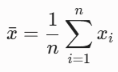
Mean (): The arithmetic average:

Best suited for symmetric data without severe outliers.
-
Median (): The exact middle value when data is ordered. Preferred for skewed distributions or datasets with extreme values.
-
Mode: The most frequently occurring observation. Essential for nominal categorical variable reporting.
Measures of Dispersion (Variability)
Dispersion quantifies how widely observations spread out around the center:
-
-
Standard Deviation () & Variance (): Measure average squared distance from the mean.
-

-
-
Interquartile Range (): The spread of the middle 50% of values:
-
In a standard normal distribution, 68.3% of data points fall within , 95.4% within , and 99.7% within (Altman & Bland, 1995).
Graphical Diagnostics: The Box Plot
Visualization is crucial for spotting anomalies that summary statistics hide (Anscombe, 1973). For identifying skewness and outliers, Tukey’s box plot remains a gold standard.
-
Box Boundaries: (25th percentile) to (75th percentile), enclosing the .
-
Center Line: Median ().
-
Whiskers: Extend to beyond the quartiles.
-
Outliers: Individual points plotted beyond the whiskers.
2. Best Practices by Field of Study
3. Higher-Order Moments: Skewness & Kurtosis
When analyzing distributions beyond central tendency and spread, skewness and kurtosis—the 3rd and 4th standardized moments—describe asymmetry and tail behavior.
Skewness: Measuring Asymmetry
Sample skewness () quantifies the degree of asymmetry around the mean:


-
: Symmetric distribution.
-
(Positive / Right-Skewed): Right tail is elongated ().
-
(Negative / Left-Skewed): Left tail is elongated ().
Kurtosis: Measuring Tail Weight & Extremes
Kurtosis measures the propensity for extreme values in the tails relative to a normal distribution (Westfall, 2014). Excess Kurtosis () subtracts 3 so a standard normal curve equals 0:

-
Mesokurtic (): Normal tail weight.
-
Leptokurtic (): Heavy-tailed (“fat tails”), prone to frequent extreme outliers.
-
Platykurtic (): Light-tailed, fewer extreme outliers than a normal curve.
Real-World Domain Examples
-
Finance: Daily stock market returns often display negative skewness (gradual gains punctuated by severe market crashes) and leptokurtosis (fat tails causing black swan events). Assuming normality leads risk models like Value-at-Risk () to understate catastrophic losses.
-
Biology: Clinical biomarkers (e.g., viral loads or serum ferritin) exhibit positive skewness due to a lower physical bound at zero and hyper-reactive outliers. Conversely, birth weights often show platykurtosis due to stabilizing natural selection.
4. Diagnostic Testing for Normality
To verify whether sample data satisfies normality assumptions, analysts combine visual tools with formal hypothesis testing.
Quantile-Quantile (Q-Q) Plots
A Normal Q-Q plot graphs empirical sample quantiles against theoretical quantiles from a standard normal distribution :
-
Order sample observations: x(1) ≤ x(2) ≤ ⋯ ≤ x(n).
-
Calculate empirical cumulative ranks:

-
Obtain theoretical standard normal quantiles:


-
Plot zi,x(i) alongside a linear reference line.

Q-Q Plot Diagnostics for Skewness, Kurtosis, and Tail Weight. Source: GitHub Pages
-
Heavy Tails (Leptokurtic): Points form an “S” shape—falling below the line on the left, exceeding it on the right.
-
Right Skew: Points curve upward in an inverted “U” shape.
-
Left Skew: Points curve downward in a “U” shape.
Formal Normality Tests
When visual inspection requires statistical confirmation, two primary goodness-of-fit tests are widely used:
1. The Shapiro-Wilk Test ()
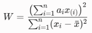
The Shapiro-Wilk test (1965) evaluates the correlation between ordered sample values and normal order statistics:
-
Mechanism: lies between 0 and 1 (). Deviations in skewness or kurtosis reduce the numerator, driving below 1.
-
Best Use: Highly powerful for small to moderate sample sizes ( up to ).
2. The Jarque-Bera Test ()
The Jarque-Bera test (1980) directly evaluates sample skewness () and excess kurtosis ():

-
Mechanism: Under (normality), asymptotically follows a Chi-Square distribution with 2 degrees of freedom (). Any non-zero skewness or excess kurtosis inflates .
-
Best Use: Large datasets (), particularly in econometrics and financial modeling.
References
-
Altman, D. G., & Bland, J. M. (1995). Statistics notes: The normal distribution. BMJ, 310(6975), 298.
-
Anscombe, F. J. (1973). Graphs in statistical analysis. The American Statistician, 27(1), 17–21.
-
Jarque, C. M., & Bera, A. K. (1980). Efficient tests for normality, homoscedasticity and serial independence of regression residuals. Economics Letters, 6(3), 255–259.
-
Shapiro, S. S., & Wilk, M. B. (1965). An analysis of variance test for normality (complete samples). Biometrika, 52(3/4), 591–611.
-
Tukey, J. W. (1977). Exploratory Data Analysis. Addison-Wesley.
-
Westfall, P. H. (2014). Kurtosis as peakedness, 1905–2014. R.I.P. The American Statistician, 68(3), 191–195.


